The Cone of Uncertainty Explained


this is a really poor job of data visualization. What they should be showing is the area that has the potential of being affected. Which is what most people probably think the cone represents.

drummerboy said:
this is a really poor job of data visualization. What they should be showing is the area that has the potential of being affected. Which is what most people probably think the cone represents.
That is exactly what this is.
WxNut2.0 said:
drummerboy said:
this is a really poor job of data visualization. What they should be showing is the area that has the potential of being affected. Which is what most people probably think the cone represents.
That is exactly what this is.
The caption on max's photo says that effects can occur outside of the cone.

If you take the time to read the article, it says that the track of the center of the storm is expected to travel within the cone, leaving roughly 1/3 chance that the center won’t even be in the cone.
If the graphic showed all possible paths, and all areas possibly affected, the swath would be so wide as to render the warning meaningless.
There are limits to the prediction.
I read the article, thank you very much.
The point of the article is why/how it's misinterpreted. That such a widely used graphic is misinterpreted means there is a problem with the graphic. If there was no problem with the graphic, the NYT wouldn't have written an explainer for it.
Sure, there are limits to how much information you can pack into a single graphic. OTOH, maybe this graphic falls far short of that limit, leaving room for improvement.
Maybe they should show the entire US as a potential area of influence, because it is.
That way it couldn’t be misinterpreted.
drummerboy said:
WxNut2.0 said:
drummerboy said:
this is a really poor job of data visualization. What they should be showing is the area that has the potential of being affected. Which is what most people probably think the cone represents.
That is exactly what this is.
The caption on max's photo says that effects can occur outside of the cone.
The cone is made to show where the hurricane is likely to impact, and it is based upon climatological paths of similar hurricanes. It is damn near impossible to forecast exact impacts at any lead time beyond 2 or so days.

I like the cone of uncertainty.
I also like the spaghetti models.
DB: Maybe you'd prefer this graphic:
https://www.cyclocane.com/dorian-spaghetti-models/
(and the CNN spaghetti model explainer):
https://www.cnn.com/2019/08/29/weather/spaghetti-models-explainer-hurricanes-trnd/index.html
sprout said:
I like the cone of uncertainty.
I also like the spaghetti models.
DB: Maybe you'd prefer this graphic:
https://www.cyclocane.com/dorian-spaghetti-models/
(and the CNN spaghetti model explainer):
https://www.cnn.com/2019/08/29/weather/spaghetti-models-explainer-hurricanes-trnd/index.html
Spaghetti plots need to be used with extreme caution, as not all models are created equal.
Understood. In reading the CNN 'explainer', it made me wonder if some of the spaghetti lines might be from the "Ensemble or consensus models ... created by combining the forecasts from a collection of other models."
Specifically, when the lines start to converge, the interpretation is greater confidence in the predicted path, right? However, if some of the lines shown are averages of some of the other lines, then it could make it appear that more convergence is occurring in the models than really is.
sprout said:
Understood. In reading the CNN 'explainer', it made me wonder if some of the spaghetti lines might be from the "Ensemble or consensus models ... created by combining the forecasts from a collection of other models."
Specifically, when the lines start to converge, the interpretation is greater confidence in the predicted path, right? However, if some of the lines shown are averages of some of the other lines, then it could make it appear that more convergence is occurring in the models than really is.
Each individual line either represents a single model run or one of the iterations of the model runs that make up an ensemble. The first instance may be made up of multiple individual models whereas the second is one model run multiple times with different initial conditions. In either case a convergence of lines indicates, as you correctly point out, that confidence is likely higher. This is not always the case though and it assumes that the models are adequately representing all possible outcomes that we should expect to see in the atmosphere. This is not always a fair assumption and can lead to substantial uncertainty in some cases. On the whole though, convergence is usually a good thing.
You’re also correct about the mean line, as it may make things appear to be more convergent than they are. It’s mostly shown for convenience though, as statistically speaking the expected value (e.g., what is the most likely outcome) is the mean. Therefore the mean line should give us a sense of the most likely outcome. Needless to say, it can get complicated quickly.


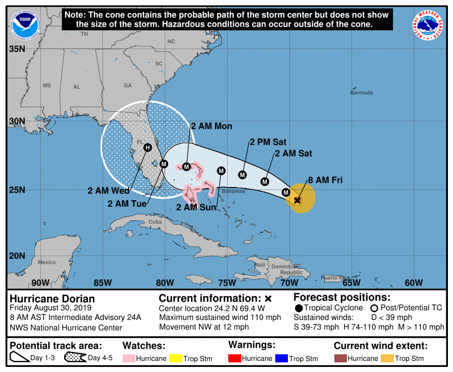
Good explanation of the National Hurricane Center's "Cone of Uncertainty" graphic from the New York Times.
How to Read a Hurricane Map (the Right Way) https://www.nytimes.com/interactive/2019/08/29/opinion/hurricane-dorian-forecast-map.html